
How to Create a Focal Point in Your Painting Using Contrast
Have you ever finished a painting and felt like something was missing, even though all the individual elements looked beautiful?
Maybe you've chosen colors you love, created interesting shapes, and added plenty of details, but something about the composition just doesn't feel quite right.
Sometimes the problem isn't what's in your painting.
It's that everything is competing for attention.
One of the most important things I've learned as an artist is that not every area of a painting needs to stand out.
In fact, some of the most beautiful compositions are created by intentionally allowing certain areas to fade into the background.
And one of the most effective ways to do that is through contrast.
How Contrast Guides the Viewer's Eye
In painting, contrast refers to the difference between visual elements, such as light and dark values, colors, or textures.
One of the most powerful types of contrast is the relationship between light and dark.
When a very light area sits next to a dark area, it naturally attracts attention.
But when two areas have similar values, they tend to blend together and feel quieter.
High contrast draws the eye, while low contrast allows an area to fade into the background.
Understanding this relationship gives you more control over how someone experiences your painting.
Instead of hoping the viewer notices the most important part of your composition, you can intentionally guide their attention toward it.
And that's exactly what I focused on while painting our We Took to the Woods tutorial inside Studio B Art Club.
Creating a Focal Point in a Landscape Painting
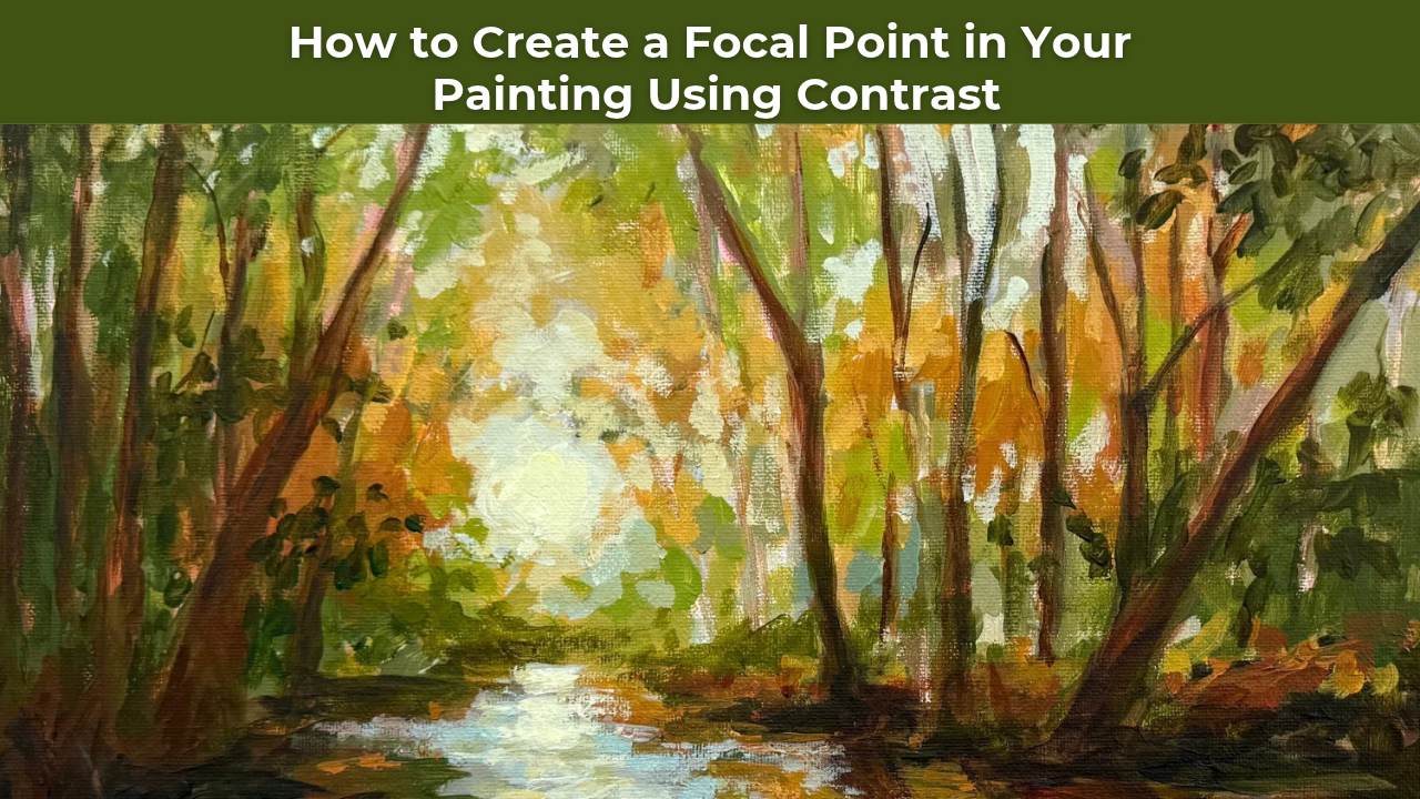
In We Took to the Woods, we painted a sunlit creek winding through a forest.
Light bursts through the trees and shimmers across the water, while the woods on the left side sit in deep, quiet shadow.
That shadowy side is dark and a little difficult to read.
And that was completely intentional.
I wanted the viewer's eye to travel toward the sunlight and its reflection on the creek.
To make that happen, I needed to create a clear difference between the areas that deserved attention and the areas that were simply there to support the composition.
I like to think of these as the spotlight and the quiet zones.
The Spotlight: Where You Want the Viewer to Look
Every painting benefits from having an area that feels especially important.
This is your focal point.
In my forest painting, the focal point was the bright sunlight breaking through the trees and reflecting onto the water.
That's where I wanted the viewer's eye to land.
So I saved the brightest mixture of the entire painting—a light value of white with a touch of yellow—for that particular area.
By placing those bright highlights against the darker surrounding trees, I created a strong contrast that naturally draws attention.
And because I didn't use that same level of brightness everywhere else, the focal point remained special.
Your brightest highlights become much more powerful when you use them intentionally.
If every area of the painting contains equally bright highlights, those highlights begin competing with one another.
But when you reserve your strongest contrast for the focal point, you create a natural visual hierarchy.
The viewer knows where to look first.
The Quiet Zones: Why Some Areas Should Fade Into the Background
Just as important as the focal point are the areas that support it.
In We Took to the Woods, the shadowy woods on the left side of the painting were intentionally kept quiet.
I didn't want every tree trunk, branch, and patch of foliage to demand attention.
Instead, I kept the values relatively close together, allowing some of the shapes to blend into one another.
Even when I introduced warmer golds into those areas, I used a light touch so they wouldn't compete with the sunlight.
This created a beautiful contrast between the quiet, shadowy woods and the bright opening in the distance.
Not every part of your painting needs to be equally defined, detailed, or bright.
Sometimes allowing an area to remain subtle is exactly what makes the rest of the composition stronger.
These quiet zones give the viewer's eye somewhere to rest.
And they make the areas of greater contrast feel even more important.
Four Ways to Create a Stronger Focal Point in Your Paintings
If your paintings tend to feel busy or your viewer's eye doesn't naturally settle on one area, here are four techniques you can practice.
1. Save Your Strongest Contrast for the Focal Point
Before you begin painting, think about where you want the viewer's attention to go.
Then consider how you can use the relationship between light and dark to emphasize that area.
You might place a bright highlight against a deep shadow or introduce a darker accent beside a lighter shape.
The goal isn't necessarily to make your focal point the brightest object in the painting.
It's to create a strong enough contrast that the area naturally attracts attention.
2. Keep Supporting Areas Quieter
Once you've established your focal point, look at the surrounding areas.
Are there bright highlights or strong dark accents competing for attention?
Could you soften some of those contrasts?
In my forest painting, I intentionally kept the shadowy woods relatively low in contrast.
The shapes were still there, but they weren't demanding the same attention as the sunlight.
This is a simple way to create depth and make your composition feel more intentional.
3. Use Shapes and Lines to Lead the Eye
Contrast isn't the only way to guide the viewer's attention.
You can also use the shapes within your composition to create movement.
In We Took to the Woods, the dark creek banks form angled shapes that naturally lead the viewer toward the light.
The direction of the water reinforces that movement.
Together, these elements encourage the viewer's eye to travel through the painting rather than stopping at the edges.
When planning your next composition, look for natural lines and shapes that can help direct attention toward your focal point.
4. Practice Restraint With Your Final Highlights
This might be one of the hardest parts of finishing a painting!
It's tempting to keep adding bright highlights because they can make individual areas look beautiful.
But if you add equally strong highlights everywhere, you may unintentionally weaken your focal point.
Before adding another bright mark, ask yourself:
Does this strengthen the composition, or is it pulling attention away from where I want the viewer to look?
Sometimes the best decision is to leave an area alone.
A little restraint can make your strongest highlights feel even more powerful.
Why Focal Point Placement Matters
Another important part of creating an engaging composition is deciding where to place your focal point.
While there's nothing inherently wrong with placing a focal point in the center of a painting, positioning it slightly off-center can often create a more dynamic composition.
One common guideline artists use is the rule of thirds.
Imagine dividing your canvas into three equal sections horizontally and vertically.
The intersections of those lines can provide useful starting points for placing important elements.
In my forest painting, the focal point sits slightly off-center, helping create a more natural sense of movement through the composition.
Of course, the rule of thirds isn't something you have to follow in every painting.
It's simply another tool you can use when making intentional decisions about your composition.
A Simple Exercise to Improve Your Painting Composition
Here's something I want you to try with your next painting.
Step back from your canvas and squint your eyes.
When you squint, many of the smaller details begin to disappear, making it easier to recognize the larger shapes and value relationships.
Now ask yourself:
Where does my eye go first?
Is that where you want the viewer's attention to go?
If something else is grabbing your attention, look at the contrast in that area.
Could you soften it?
Darken a highlight?
Bring the values closer together?
Or perhaps your focal point needs a little more contrast to help it stand out.
You don't necessarily need to make dramatic changes.
Sometimes a few small adjustments can completely transform how your eye moves through a painting.
And the more you practice evaluating your compositions this way, the more naturally you'll begin making these decisions throughout the painting process.
Learning to Control What Matters Most
One of the things I love most about painting is realizing that creating a beautiful composition isn't about making every individual element perfect.
It's about understanding how those elements work together.
Where do you want the viewer to look?
Which areas deserve the most attention?
And which areas can remain quiet?
These questions apply to nearly every subject you might paint.
In a floral painting, you might use your strongest contrast to emphasize one beautiful bloom while allowing the surrounding flowers to remain softer.
In a still life, you might highlight the most important object while keeping the background understated.
And in a landscape, you might use contrast to guide the viewer toward a beautiful area of sunlight.
The subject changes, but the principle stays the same: not everything needs to compete for attention.
So before your next painting, ask yourself one simple question:
Where do I want the viewer to look first?
Then give that spot the most contrast on your canvas.
You might be surprised how much stronger your painting becomes.
Learn to Create Stronger Compositions in Studio B Art Club
If you'd like to see these techniques in action, my We Took to the Woods acrylic painting tutorial is available inside Studio B Art Club.
Throughout the lesson, I demonstrate how to use contrast, value relationships, and intentional brushwork to create a sunlit forest landscape with a clear focal point.
Inside Art Club, you'll find a growing library of step-by-step acrylic painting tutorials designed to help you understand not just how to paint, but why certain artistic decisions work.
My goal is to help you develop the skills and confidence to approach new subjects, make thoughtful creative decisions, and create paintings that feel uniquely your own.
Want More Weekly Art Tips?
If you found this helpful, you’ll love our exclusive weekly art tips delivered straight to your inbox! Sign up below to get insights, painting techniques, and creative inspiration—plus first access to exciting opportunities inside Studio B.
We hate SPAM. We will never sell your information, for any reason.