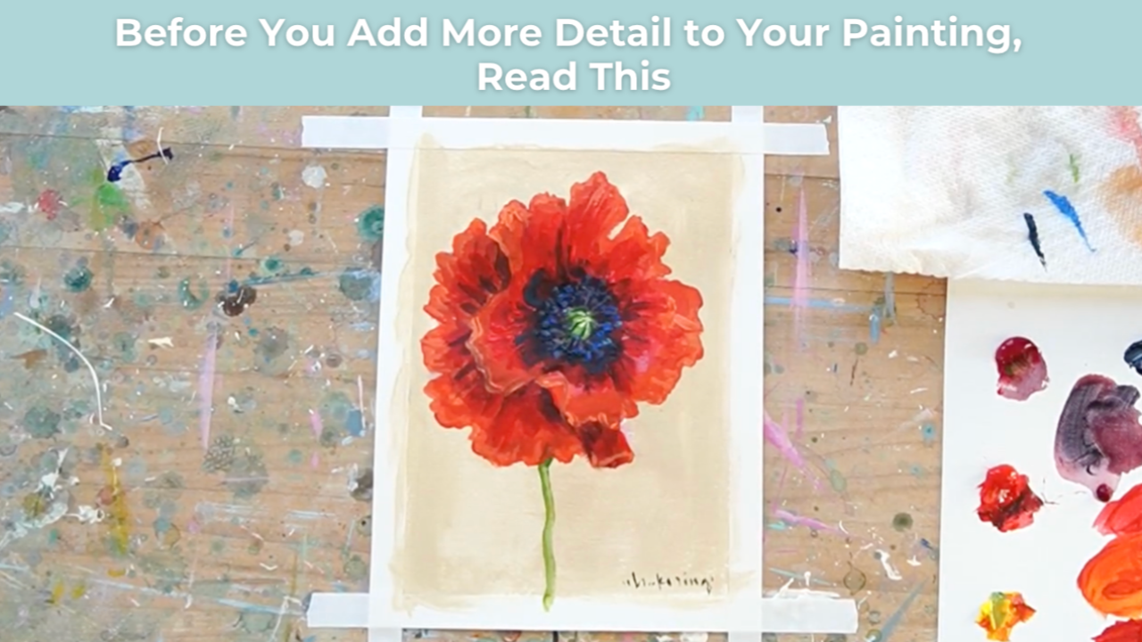
Before You Add More Detail to Your Painting, Read This
If your painting feels flat and your first instinct is to add more detail, pause for a moment.
The issue might not be detail at all.
It might be temperature contrast.
This is one of the most overlooked tools painters have for creating depth, especially in florals.
Many artists assume dimension comes from adding darker paint, stronger outlines, or more brushwork.
But often the real solution is much simpler:
Shifting color temperature.
Once you begin to see how warm and cool colors interact, your paintings start to feel layered and dimensional without becoming overworked.
Why Darker Color Isn’t Always the Answer
When painters want to create shadows, they often reach for black or simply make the color darker.
While this can work in some situations, it can also flatten the painting if everything becomes uniformly dark.
Instead of just darkening a color, try asking yourself this question:
Am I shifting the temperature of the color, or only making it darker?
Temperature contrast creates visual energy that simple darkening cannot.
Warm colors advance.
Cool colors recede.
When you place them next to each other intentionally, the forms in your painting begin to separate naturally.
How Warm and Cool Colors Create Depth
A simple example of this happens frequently when painting flowers.
Instead of creating shadows with black, you can create depth by shifting the color temperature.
For example:
Warm light:
Cadmium red + yellow
Cool shadow:
Cadmium red + cobalt blue or Payne’s gray
Both colors are still related to the same red family, but the temperature difference creates contrast.
When a red-orange highlight sits next to a red-violet shadow, something interesting happens.
The petals begin to:
- separate
- overlap
- layer
Suddenly the flower feels dimensional without adding extra detail.
Why Temperature Contrast Works So Well in Floral Paintings
Florals are naturally full of curves, overlaps, and folds.
When warm and cool variations of the same hue are used strategically, the petals start to feel like they are sitting in space rather than lying flat on the canvas.
This is what creates the sense of depth.
Instead of outlining shapes or over-blending edges, you are allowing color relationships to do the work.
The painting begins to feel softer and more natural.
The Common Mistake Many Beginners Make
Many developing painters assume the solution to a flat painting is more detail.
They think:
“I just need to refine this area more.”
But adding detail often makes the painting feel heavier instead of clearer.
What the painting usually needs is stronger color relationships.
More temperature contrast.
More intentional shifts between warm and cool tones.
When this happens, the painting gains structure without becoming overworked.
A Simple Exercise to Try in Your Next Painting
Next time you’re painting a subject like florals, try this simple shift.
Instead of darkening the shadow areas with black, experiment with cooler versions of the same color.
Ask yourself:
Where is the warm light hitting the form?
Where would a cooler shadow naturally fall?
Then place those temperatures next to each other.
You may find that the forms suddenly separate and the painting feels more dimensional without adding a single extra detail.
Learning to See Color Relationships
One of the biggest breakthroughs artists experience is learning to see how colors interact with one another.
You don’t have to memorize complicated color theory.
You simply need to start noticing how:
- warm colors advance
- cool colors recede
- temperature contrast creates depth
Once you begin to see these relationships, you start to notice them everywhere.
And once you see it, you really can’t unsee it.
Final Thoughts
Before adding more brushstrokes or details to a painting that feels flat, take a moment to evaluate your color temperature.
Ask yourself:
Are my shadows simply darker?
Or are they cooler?
That small shift can instantly elevate your painting and create depth in a much more natural way.
Sometimes the most powerful improvements in painting come not from doing more, but from understanding how color works together.
Want More Weekly Art Tips?
If you found this helpful, you’ll love our exclusive weekly art tips delivered straight to your inbox! Sign up below to get insights, painting techniques, and creative inspiration—plus first access to exciting opportunities inside Studio B.
We hate SPAM. We will never sell your information, for any reason.