How to Choose the Right Background Color for Your Painting
One of the questions I hear from artists all the time is, "How do you know what color to paint your background?"
And my answer might surprise you.
You don't have to decide on your final background color before you start painting.
I think one of the biggest misconceptions about painting is that you need to have every decision figured out before your brush ever touches the canvas.
You need to know your color palette, your composition, your background color, and exactly how everything is going to come together.
But that's not how I approach my paintings.
In fact, I often begin with a background color knowing there's a good chance I'll change it later.
And there's a very intentional reason for that.
Why I Don't Choose My Final Background Color First
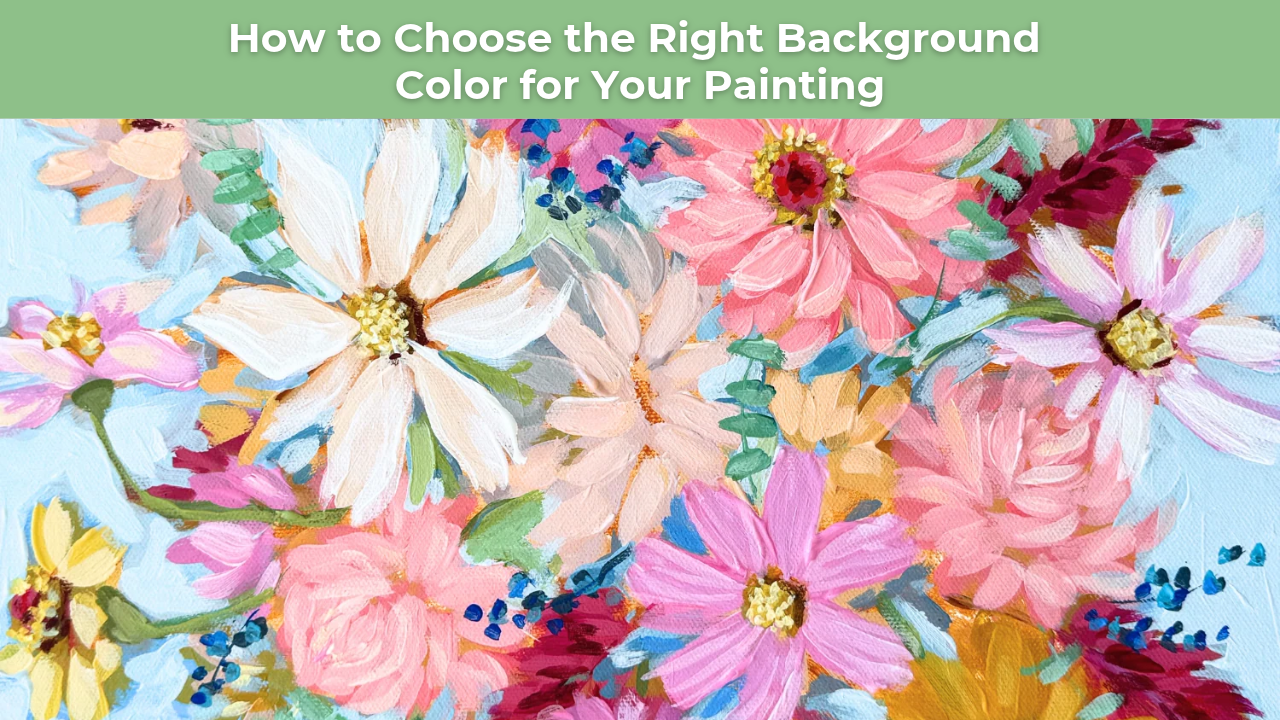
While painting our Floral En Masse tutorial inside Studio B Art Club, I started with a mid-tone blue background.
Not too light.
Not too dark.
And definitely not a color I was committed to keeping!
At that stage, I was much more interested in establishing the shapes and colors of my flowers than making a final decision about the background.
I wanted to give myself room to experiment and see how the painting developed.
Because here's something important to remember:
Your painting is going to change as you paint it.
Colors look different once they're sitting next to one another on the canvas. Your focal point might shift. You may realize you need more contrast, or perhaps certain areas need to be softened.
And a background color that looked beautiful when you first started might not be the best choice once the rest of your painting comes together.
That's completely normal.
How Your Background Color Affects the Rest of Your Painting
Your background plays an important role in the overall composition.
It influences how your subject stands out, how colors relate to one another, and how the viewer's eye moves through the painting.
For example, imagine you're painting a colorful floral arrangement.
A light background might create a soft, airy feeling, while a darker background could make the flowers feel more dramatic.
A warm background might emphasize the cooler colors in your flowers, while a cool background could create a beautiful contrast with warmer pinks, oranges, and yellows.
Even a subtle change in the background can dramatically affect how the entire painting feels.
This is why I don't always want to commit to my final background color before I've established the rest of my composition.
I want to see what the painting needs first.
Why I Like Starting With a Mid-Tone Background
When I'm not sure what my final background color will be, I often begin somewhere in the middle.
A mid-tone color gives me a flexible starting point.
It's not so light that I'm immediately committed to a bright, airy composition, and it's not so dark that everything has to compete against a dramatic background.
Instead, it allows me to establish my subject and begin evaluating the relationships between my colors.
In my Floral En Masse painting, the initial blue background gave me a starting point for building the arrangement.
As I developed the flowers, I could see how the pinks, oranges, yellows, and greens interacted with that blue.
And once the flowers were established, I had a much better understanding of what the background needed to do.
This approach also helps me avoid spending too much time trying to make a decision before I have enough information.
Sometimes you simply need to start painting to see what works.
Four Questions to Ask Before Choosing Your Final Background Color
Once I've established the main shapes and colors in my painting, I like to step back and evaluate the background.
Rather than asking whether it matches my original reference photo, I ask myself four simple questions.
1. Does the Background Need to Be Lighter?
A lighter background can create a softer, more open feeling.
It may also help separate darker elements of your subject from the surrounding space.
If your painting feels too heavy or dark, lightening the background might help create a better sense of balance.
2. Does the Background Need to Be Darker?
Sometimes a painting needs more contrast.
If your subject feels like it's disappearing into the background, darkening the surrounding color may help certain shapes stand out.
This can be especially effective in floral paintings where you want to emphasize the beautiful shapes and colors of individual blooms.
3. Does the Background Need to Be Warmer?
Color temperature can completely change the mood of a painting.
If your composition feels too cool, introducing a warmer background might help create a more inviting, harmonious feeling.
Warm backgrounds can also create interesting relationships with cooler colors in your subject.
4. Does the Background Need to Be Cooler?
On the other hand, a cooler background might provide the contrast your painting needs.
For example, a soft blue or blue-green background can create a beautiful relationship with warm pink, coral, orange, and yellow flowers.
This is something I especially love experimenting with in my floral paintings.
The key is to evaluate how the colors are working together rather than considering the background in isolation.
Why It's Easier to Adjust Your Background Than Your Entire Painting
One of the biggest reasons I prefer to leave my background flexible is actually very practical.
It's much easier to adjust one background color than hundreds of colors throughout your painting.
Think about it.
If you've carefully selected your background color before painting your subject, you may find yourself making countless adjustments to the flowers, leaves, or other elements just to make everything work with that original decision.
But what if you approached it the other way around?
What if you established your subject first, developed the colors you loved, and then adjusted the background to support the composition?
Suddenly, you have much more freedom.
Instead of trying to force every element to work with a predetermined background, you can make one thoughtful adjustment that brings the entire painting together.
This is especially useful when working with acrylics because you can build layers and make changes as the painting develops.
Learning to Make Decisions as You Paint
While this article is about choosing background colors, I think there's a much bigger lesson here.
You don't have to have every decision figured out before you begin.
One of the most valuable skills you can develop as an artist is learning to respond to what's happening on your canvas.
You might begin with one idea and discover something entirely different as you paint.
A color combination might surprise you.
A shape might need to be simplified.
A background might need to change.
And that's not a sign that you made a mistake.
It's part of the creative process.
The more comfortable you become making these decisions, the more confidence you'll develop in your own artistic eye.
You'll begin to understand that painting isn't simply about following a predetermined plan.
It's about observing, evaluating, experimenting, and making thoughtful decisions along the way.
Give Yourself Permission to Change Your Mind
The next time you sit down to paint, don't let uncertainty about your background color keep you from getting started.
Choose a color that gives you a good foundation.
Begin developing your subject.
Pay attention to how the colors interact.
And when you have a better understanding of what your painting needs, revisit your background.
You might decide the original color was perfect.
Or you might discover that changing it makes the entire composition stronger.
Either way, you've learned something valuable through the process.
Put something down. Step back. Respond to what's happening on the canvas. Then make your next decision.
That's how you begin developing the confidence to create paintings that feel uniquely your own.
Learn to Paint with Confidence in Studio B Art Club
If you'd like to see this approach in action, my Floral En Masse acrylic painting tutorial is available inside Studio B Art Club.
Throughout the lesson, I walk you through the process of building a loose, colorful floral arrangement while making creative decisions about color, composition, and background along the way.
Inside Art Club, you'll find a growing library of step-by-step acrylic painting tutorials designed to help you develop your artistic eye, strengthen your painting skills, and become more confident in your own creative decisions.
Whether you're just beginning or looking to develop a looser, more expressive painting style, I'd love to paint alongside you!
Want More Weekly Art Tips?
If you found this helpful, you’ll love our exclusive weekly art tips delivered straight to your inbox! Sign up below to get insights, painting techniques, and creative inspiration—plus first access to exciting opportunities inside Studio B.
We hate SPAM. We will never sell your information, for any reason.