
How to Create Rich, Glowing Colors in Acrylic Paintings
Have you ever painted something with beautiful, vibrant colors, only to find that your finished painting looks a little flat?
You've chosen the right colors. You've placed them where they belong. But somehow, the painting doesn't have the same richness or luminosity you see in your reference photo.
One of the biggest lessons I've learned as an artist is that the most beautiful colors in a painting often come from what's happening underneath the surface.
It's not always about finding the perfect paint color.
Sometimes it's about how you build that color through layers.
And once you understand how to do that, you can create so much more depth, movement, and vibrancy in your paintings.
Why Painting Colors in Separate Patches Can Look Flat
While teaching our Chrysanthemum tutorial inside Studio B Art Club, I pointed out something that's easy to overlook.
The best part of the flower is the color you can barely see.
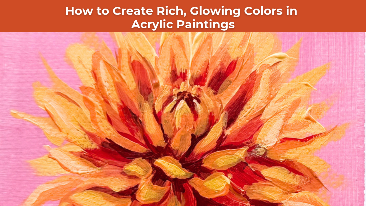
Our chrysanthemum was filled with beautiful, fiery colors.
Deep red near the center.
Warm orange throughout the middle.
Bright yellow at the tips of the petals.
When you look at a flower like that, it's tempting to paint each color exactly where you see it.
Red here.
Orange there.
Yellow at the tips.
Done!
But when we approach color this way, the transitions can begin to look harsh or disconnected.
Instead of creating a flower that feels dimensional and full of light, we end up with separate patches of color sitting beside one another.
The secret is learning to build your colors rather than simply placing them.
How Layering Colors Creates Depth in Acrylic Paintings
One of my favorite things about acrylic painting is the ability to build color through layers.
Rather than trying to achieve the final color immediately, I like to establish a foundation and gradually develop the relationships between colors.
This allows earlier layers to influence the colors that come afterward.
Sometimes those underlying colors remain visible between brushstrokes.
Other times, they mix with the next layer while the paint is still wet.
And sometimes, small areas of contrasting color peek through the final painting, creating beautiful visual interest.
All of these interactions contribute to the richness of the finished artwork.
In my chrysanthemum painting, I wanted the flower to feel like it was glowing.
And achieving that effect required more than simply placing red, orange, and yellow in the correct locations.
I needed those colors to interact with one another.
How I Built the Colors in My Chrysanthemum Painting
Rather than jumping straight to the final colors, I developed the flower through several stages.
Here's how I approached the process.
1. Start With a Simple Block-In
I began by establishing the overall shape of the chrysanthemum using yellow.
At this stage, I wasn't concerned with painting every individual petal or creating perfect details.
I simply wanted to establish the larger mass of the flower and give myself a foundation to build upon.
Starting with yellow also allowed that warmth to influence the colors I would add later.
2. Introduce Orange While the Paint Is Still Wet
Next, I worked a muddy orange into the center of the flower while the yellow paint was still wet.
This allowed the colors to interact naturally rather than creating a harsh separation between them.
The orange began to establish depth and variation throughout the petals.
And because I wasn't completely covering the yellow underneath, those earlier colors continued to contribute to the overall effect.
3. Add Deeper Reds for Contrast
Once the initial colors were established, I introduced deeper reds toward the center of the flower.
These darker, warmer colors helped create a sense of depth and gave the lighter petals something to contrast against.
Without those deeper values, the flower would have felt much flatter.
This is an important part of creating dimension in a painting.
Your brightest colors often become more effective when they're surrounded by darker or more subdued colors.
4. Layer Orange and Yellow Back on Top
Finally, I began layering brighter oranges and yellows back over the earlier colors.
But here's the important part:
I didn't cover everything up.
I intentionally allowed portions of the underlying colors to remain visible.
Those little glimpses of orange and red helped create depth between the petals and made the brighter yellow highlights feel more luminous.
When I added those final yellow highlights, they didn't read as plain yellow.
The orange underneath made them glow.
And that's exactly the effect I was hoping to achieve.
Why You Shouldn't Cover Up Every Underlayer
One of the most common habits I see artists develop is trying to cover every bit of their previous layer as they work toward a finished painting.
But sometimes those earlier layers are what make the final painting interesting.
Think about a colorful flower.
If every petal is painted with one perfectly mixed color, the result can feel flat.
But when small areas of earlier colors remain visible, they create subtle variations that give the flower more life.
A little orange peeking through a yellow petal.
A touch of red beneath a warmer highlight.
An unexpected color showing through between two overlapping shapes.
These small details create relationships that make the painting feel richer.
Your underlayers aren't mistakes to cover up. They're what give your color depth.
Of course, you don't need to preserve every mark from your earlier layers.
The goal is to make intentional decisions about which colors to reveal and which areas need further development.
Five Tips for Creating More Vibrant Colors in Your Paintings
If your acrylic paintings tend to look flat or your color transitions feel harsh, here are a few things you can practice.
1. Think in Layers, Not Individual Colors
Instead of asking yourself which single paint color matches your reference photo, consider how you could build that color.
Could you begin with a warmer or cooler underlayer?
Would a darker color underneath help your highlights stand out?
Thinking in layers gives you more opportunities to create interesting color relationships.
2. Allow Some Colors to Mix Naturally
When appropriate, try introducing your next color while the previous layer is still wet.
This can create softer transitions and unexpected color variations.
You don't need to blend everything perfectly.
Sometimes a few loose brushstrokes are enough to connect two colors.
3. Preserve Some of Your Earlier Layers
As you develop your painting, resist the urge to cover every inch of your underpainting.
Allow small areas of those earlier colors to remain visible.
They can create beautiful contrast and add energy to your brushwork.
4. Use Darker Values to Make Highlights Stand Out
Bright colors often feel more luminous when they're placed next to darker values.
In my chrysanthemum painting, the deeper reds helped emphasize the brighter oranges and yellows.
This relationship between light and dark is just as important as the colors themselves.
5. Step Back Before Adding Another Layer
Before covering an area with more paint, take a moment to evaluate what's already there.
Are the underlying colors adding something interesting?
Does the area need more contrast?
Would another layer strengthen the painting, or would it cover up something beautiful?
Sometimes the best decision is to leave a little of that earlier color showing.
This Technique Works Beyond Painting Flowers
Although I demonstrated this approach in our Chrysanthemum tutorial, the same principle applies to so many other subjects.
Think about painting a sunset.
Rather than placing orange, pink, and yellow in separate sections of the sky, you can build those colors in layers to create more natural transitions.
Or imagine painting a field of grass.
Instead of using one flat green, you might begin with warmer earth tones, introduce cooler greens, and allow small areas of those earlier colors to remain visible.
Even in a simple still life, layering colors can help create richer shadows, more interesting highlights, and a greater sense of depth.
The subject changes, but the principle stays the same: build your color instead of simply placing it.
Learning to See What's Beneath the Surface
One of the things I love most about painting is discovering how much the earlier stages influence the finished artwork.
Sometimes the colors that make a painting beautiful are the ones you can barely see.
A small touch of orange beneath a yellow highlight.
A warm underpainting peeking through a cooler layer.
A darker color adding depth between two shapes.
These details may seem insignificant on their own, but together they can completely transform a painting.
The next time you sit down to paint, I want you to think beyond the final color you see in your reference.
Ask yourself what colors could go underneath.
Experiment with building your colors in stages.
And don't be afraid to let those earlier layers show through.
Because sometimes the most beautiful part of your painting is what's happening beneath the surface.
Learn to Build Beautiful Color in Studio B Art Club
If you'd like to practice these techniques alongside me, my Chrysanthemum acrylic painting tutorial is available inside Studio B Art Club.
Throughout the lesson, I demonstrate how to build rich, glowing colors through layering, blending, and intentional brushwork.
Inside Art Club, you'll find a growing library of step-by-step acrylic painting tutorials designed to help you understand not just which colors to use, but how and why they work together.
My goal is to help you develop the skills and confidence to approach new subjects, experiment with color, and create paintings that feel uniquely your own.
Want More Weekly Art Tips?
If you found this helpful, you’ll love our exclusive weekly art tips delivered straight to your inbox! Sign up below to get insights, painting techniques, and creative inspiration—plus first access to exciting opportunities inside Studio B.
We hate SPAM. We will never sell your information, for any reason.