
How to Create Stronger Paintings by Repeating Color
One of the biggest shifts you can make as an artist is realizing that your reference photo isn't there to make every decision for you.
When you first begin a painting, the reference is essential. It helps you establish your composition, identify the major shapes, and build a strong foundation.
But somewhere along the way, the question should change.
Instead of asking, "What does the reference photo look like?"
Start asking, "What does my painting need?"
One of my favorite ways to strengthen a composition is through something surprisingly simple: repeating colors throughout a painting.
Why Repeating Colors Makes a Painting Stronger
Have you ever looked at a painting and felt like something was missing, even though all the individual elements looked beautiful?
Sometimes the problem isn't the colors you've chosen. It's how those colors are distributed throughout the composition.
When a color appears in only one area of a painting, it can draw the viewer's attention to that spot without encouraging their eye to explore the rest of the artwork.
But when that same color appears in several places, it begins to create a visual connection between different elements.
Repeating colors helps establish rhythm, balance, and movement throughout a painting.
For example, imagine you're painting a colorful beach scene.
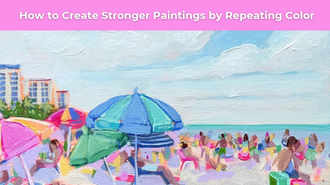
If a beautiful turquoise blue appears only in one umbrella, your eye may stop there. But when you introduce touches of that same turquoise into a beach chair, a swimsuit, or another umbrella, you begin connecting those elements.
The viewer's eye naturally moves between them, creating a more unified composition.
This doesn't mean every color needs to appear everywhere. The goal is to create intentional relationships that make the painting feel cohesive.
Using Your Reference Photo as a Starting Point
While painting my Beach Weekend tutorial for Studio B Art Club, I found myself making these kinds of decisions over and over again.
I began with a reference photograph of a busy beach scene filled with colorful umbrellas, people, and beautiful summer light.
But as the painting developed, I realized that faithfully recreating every detail wouldn't necessarily produce the strongest composition.
I needed to simplify.
I adjusted colors, eliminated distracting details, and repeated certain colors throughout the painting to create a greater sense of balance.
These weren't changes I made because the reference photograph told me to.
They were decisions I made because the painting needed them.
And that's an important distinction.
Your reference photo should inform your painting, not control it.
How to Use Color Repetition in Your Own Paintings
Color repetition is something you can begin practicing immediately, regardless of your experience level or the subject you're painting.
Here are a few ways to incorporate it into your creative process.
1. Identify Your Dominant Colors
Before you begin painting, take a moment to identify the colors that will play the biggest roles in your composition.
You don't need to use every color you see in your reference photo.
In fact, simplifying your palette can often create a stronger, more harmonious painting.
Choose a few colors that work beautifully together and allow them to become the foundation of your composition.
2. Repeat Colors in Unexpected Places
As you paint, look for opportunities to introduce small touches of your dominant colors into other areas.
If you're painting a floral arrangement, you might repeat a soft pink from one flower in the shadows of another.
If you're painting a landscape, you might carry a touch of blue from the sky into the shadows of the foreground.
And if you're painting a beach scene like my Beach Weekend tutorial, you might repeat colors from the umbrellas in the clothing, chairs, or other details.
These small decisions help connect different areas of the painting without making everything look identical.
3. Pay Attention to Visual Balance
Step back from your painting frequently and notice where your eye goes first.
Does one area feel unusually heavy or distracting?
Is there a bright color that appears only once and pulls too much attention?
Sometimes repeating a small amount of that color elsewhere can help balance the composition.
You don't necessarily need to make a dramatic change. Even a few intentional brushstrokes can make a difference.
4. Don't Be Afraid to Change Your Reference
This might be the most important tip of all.
If your painting needs another touch of blue, add it.
If a distracting detail needs to disappear, leave it out.
If simplifying a shape or adjusting a color would strengthen the composition, give yourself permission to make that change.
You're creating a painting, not documenting a photograph.
And the decisions you make along the way are what begin to give your work its own personality.
Learning to Make Your Own Artistic Decisions
One of the things I love most about teaching painting is watching artists become more confident in their own creative decisions.
In the beginning, it's natural to rely heavily on your reference photo. You're learning how to see shapes, understand values, mix colors, and translate what you observe onto the canvas.
But as those skills develop, you can begin thinking beyond what you see.
You start considering how colors relate to one another, where you want the viewer's eye to travel, and what you can simplify to make the composition stronger.
And that's when painting becomes especially rewarding.
You're no longer simply trying to recreate something beautiful.
You're learning how to create something beautiful through your own artistic decisions.
So the next time you sit down to paint, let your reference guide you, but don't be afraid to edit it.
Simplify a shape. Leave out a distracting detail. Repeat a color if it strengthens the composition.
Sometimes the best artistic decisions are the ones your reference photo never suggested.
Learn More Inside Studio B Art Club
If you'd like to see these principles in action, my Beach Weekend acrylic painting tutorial is available inside Studio B Art Club.
Throughout the lesson, I demonstrate how I simplify a busy reference photo, make intentional color choices, and use repetition to create a balanced, expressive composition.
Inside Art Club, you'll find a growing library of step-by-step acrylic painting tutorials designed to help you build confidence, strengthen your artistic eye, and develop your own creative style.
Want More Weekly Art Tips?
If you found this helpful, you’ll love our exclusive weekly art tips delivered straight to your inbox! Sign up below to get insights, painting techniques, and creative inspiration—plus first access to exciting opportunities inside Studio B.
We hate SPAM. We will never sell your information, for any reason.