
How to Paint White Flowers: Understanding Warm and Cool Colors
One of the biggest misconceptions in painting is believing that white objects are painted with white paint.
They're not.
In fact, relying too heavily on white paint is often what makes white flowers look flat and lifeless.
The secret to painting beautiful, dimensional white flowers is learning to see what most people overlook: color temperature.
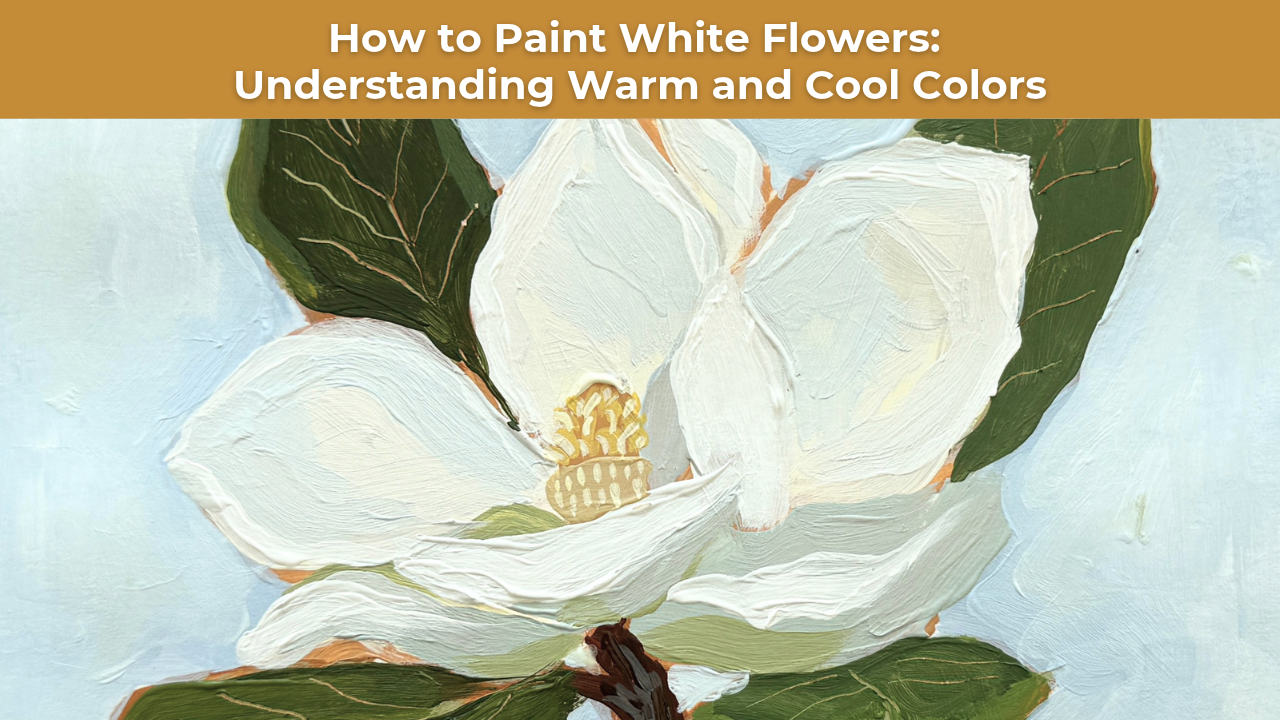
When I sat down to paint the Magnolia Skill Builder for Studio B Art Club, I wasn't actually looking for white.
I was looking for the subtle shifts between warm and cool colors that give white petals their shape, depth, and beautiful luminosity.
And once you begin noticing those shifts, you'll never look at white flowers quite the same way again.
Why White Flowers Aren't Really White
If you take a closer look at a white flower, you'll begin to notice that it's filled with subtle hints of color.
Soft buttery yellows.
Cool blue-grays.
Hints of green reflecting from the surrounding leaves.
Sometimes you'll even notice delicate touches of pink, lavender, or cream.
All of these colors work together to create the appearance of white.
If we simply paint every petal with white paint, we lose all of that richness.
The petals begin to blend together, and the flower loses its sense of dimension.
But when we introduce subtle variations in color temperature, something beautiful happens.
The petals begin to separate from one another. The shadows feel more natural. The highlights become more convincing.
And suddenly, the flower actually begins to feel white.
Understanding Warm and Cool Colors in Painting
Color temperature refers to how warm or cool a color appears in relation to the colors around it.
Warm colors generally lean toward yellow, orange, and red, while cool colors tend to lean toward blue, green, and violet.
But here's something important to understand:
Even colors that appear nearly white can have very different temperatures.
For example, one magnolia petal might lean toward a warm, creamy white, while the petal beside it has a cooler, blue-gray appearance.
The difference may be incredibly subtle, but it's often enough to create the illusion of light moving across the flower.
This is why learning to recognize temperature shifts is such a valuable skill for artists.
Instead of relying entirely on dramatic differences between light and dark, you can use warm and cool relationships to create more nuanced, expressive paintings.
How Color Temperature Creates Depth in White Flowers
When painting white flowers, I like to think about how light interacts with the different surfaces of the petals.
Some petals face directly toward the light, while others turn away or overlap.
These changes in direction create subtle variations in value and color.
For example, a petal catching warm sunlight might appear slightly creamy or yellow.
A neighboring petal turned away from the light might have a cooler blue-gray shadow.
And a petal sitting close to a green leaf might pick up a hint of reflected green.
These subtle shifts help describe the form of the flower without relying on heavy outlines or dramatic shadows.
The goal isn't to make every petal a different color. It's to create enough variation that the flower feels dimensional.
When those warm and cool colors are placed next to one another, they help create the beautiful illusion of white petals catching the light.
A Simple Mindset Shift for Painting White Subjects
One of the easiest ways to improve your ability to paint white flowers is to change the questions you're asking yourself.
When we first learn to paint, we often focus heavily on value.
We ask:
"Is this lighter or darker?"
And while understanding value is incredibly important, there's another question I want you to begin asking:
"Is this warmer or cooler?"
That one question can completely change how you observe and interpret color.
Sometimes the value difference between two petals is incredibly subtle, but their color temperatures are noticeably different.
One petal may lean toward a warm cream.
The next may have a cool blue-gray shadow.
Both may be relatively light in value, but their temperature differences help distinguish one petal from another.
Of course, color temperature doesn't replace the importance of value. The two work together to establish form, depth, and light.
But learning to recognize both gives you so much more information to work with as an artist.
Five Tips for Painting More Realistic White Flowers
The next time you're painting a white flower, try incorporating these techniques into your process.
1. Look for Color Before Reaching for White Paint
Before you begin painting, spend a few moments studying your reference photo.
Look beyond the fact that the flower is white.
Can you identify areas that feel warmer or cooler? Are there subtle yellows, blues, greens, or pinks hiding within the petals?
Those are the colors that will help bring your flower to life.
2. Save Your Brightest Whites for Highlights
Rather than beginning with pure white everywhere, build your petals using slightly tinted whites.
You can introduce brighter whites later in the painting process to emphasize the areas catching the most light.
This helps preserve contrast and makes your highlights more effective.
3. Pay Attention to Reflected Color
White petals are especially influenced by the colors surrounding them.
If your flower is surrounded by green leaves, you may notice subtle green reflections along the edges or undersides of certain petals.
Including these small touches can help your flower feel more connected to its environment.
4. Use Warm and Cool Colors to Separate Petals
When two white petals overlap, you don't always need a dark outline to distinguish them.
Sometimes a subtle shift from a warm cream to a cooler blue-gray is enough to establish the separation.
This can help your painting maintain a softer, more natural appearance.
5. Step Back and Evaluate the Flower as a Whole
It's easy to become focused on individual petals and lose sight of the overall composition.
Step back frequently and look at the relationships between your colors.
Are your warm and cool areas working together?
Do your highlights stand out?
Does the flower have enough variation to feel dimensional without becoming overly complicated?
Remember, the goal isn't to capture every tiny color variation you see. It's to simplify those observations into a beautiful, cohesive painting.
Learning to See Color Differently
One of the most rewarding parts of growing as an artist is realizing how much more there is to see.
The more you train your eye to notice subtle shifts in color, the less you'll rely on outlines and the more believable your paintings will become.
And this principle extends far beyond painting flowers.
You'll find the same warm and cool relationships in white clouds, fabric, buildings, and nearly every other white subject you encounter.
White isn't just white.
It's a beautiful collection of warm and cool colors working together.
And once you start seeing that, you'll never look at white flowers the same way again.
Learn to Paint White Flowers in Studio B Art Club
If you'd like to practice these techniques with me, my Magnolia Skill Builder is available inside Studio B Art Club.
Throughout this acrylic painting lesson, I demonstrate how to use subtle shifts in warm and cool colors to create beautiful, dimensional white petals.
Inside Art Club, you'll find a growing library of step-by-step painting tutorials designed to help you understand color, simplify shapes, and develop the confidence to approach new subjects on your own.
Whether you're just beginning your painting journey or looking to strengthen your existing skills, I'd love to paint alongside you!
Want More Weekly Art Tips?
If you found this helpful, you’ll love our exclusive weekly art tips delivered straight to your inbox! Sign up below to get insights, painting techniques, and creative inspiration—plus first access to exciting opportunities inside Studio B.
We hate SPAM. We will never sell your information, for any reason.