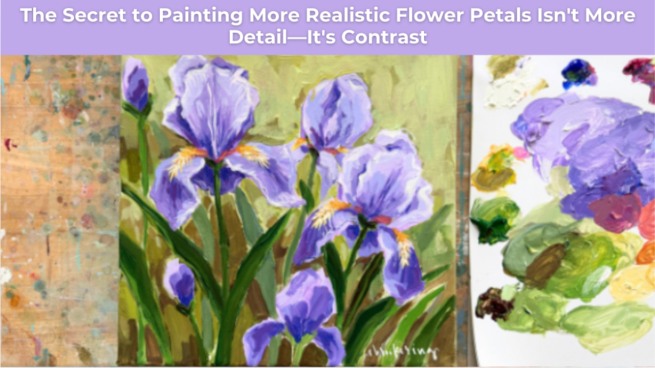
The Secret to Painting More Realistic Flower Petals Isn't More Detail - It's Contrast
If you've ever painted flowers and felt like the petals looked flat, the problem probably isn't your brushwork.
And it probably isn't because you need to add more detail.
More often than not, what your painting is missing is contrast.
Learning to use contrast intentionally is one of the simplest ways to make flower petals feel soft, dimensional, and full of life.
Dimension Comes from Value, Not Detail
When we think about creating realistic flowers, it's easy to focus on painting every ruffle, fold, and tiny edge.
But our eyes don't recognize form because of detail.
They recognize it because of changes in value.
Every petal is made up of small planes that turn toward and away from the light. As those planes shift direction, they become lighter or darker depending on how the light hits them.
That's what creates the illusion of depth.
Not perfectly outlined edges.
Not endless layers of detail.
Just thoughtful value changes.
Contrast Creates the Illusion of a Fold
One of the easiest ways to make a petal feel dimensional is by placing a darker value directly beside a lighter one.
That simple contrast tells the viewer's eye that the surface is changing direction.
Suddenly, a flat shape begins to look like a petal that's curling, folding, or catching the light.
You don't need to paint every wrinkle.
You simply need to create enough contrast for the eye to understand the form.
This is one of the reasons expressive paintings can feel so convincing while using surprisingly few brushstrokes.
Think in Planes Instead of Petals
The next time you're painting flowers, try changing the way you look at them.
Instead of seeing a petal as one complicated shape, imagine it as a collection of simple planes.
Ask yourself:
- Which part of this petal is facing the light?
- Which part is beginning to turn away?
- Where is the darkest shadow created by that change in direction?
- Where is the brightest highlight?
When you begin thinking this way, painting becomes much less about copying what you see and much more about understanding how light describes form.
That's a skill you can carry into every subject you paint.
Stop Outlining Every Edge
Another common mistake is outlining every petal in an attempt to define its shape.
While it feels like it should create clarity, outlining often flattens the painting because every edge receives the same amount of emphasis.
Instead, let value do the work.
Allow one edge to disappear into a neighboring petal.
Use a darker shadow to separate forms where needed.
Reserve your brightest highlights for the areas you want the viewer to notice first.
The result is a painting that feels softer, more natural, and much more believable.
Train Your Eye to See Light
Painting isn't about memorizing how to paint an iris, a rose, or a peony.
It's about learning to see how light behaves.
Once you understand how values work together to describe form, every flower becomes easier to paint.
You'll spend less time chasing details and more time making intentional decisions that give your paintings depth and movement.
That's one of the biggest shifts artists experience as they grow.
They stop asking, "How do I paint this flower?"
And they start asking, "How is the light moving across this form?"
A Simple Exercise to Try
The next time you're painting a flower, resist the urge to add another detail.
Instead, pause and look for just one place where a light value meets a dark one.
Strengthen that relationship.
Then step back.
You may be surprised by how much more dimensional the petal feels with just that one adjustment.
Often, it's not the number of brushstrokes that transforms a painting.
It's the intentional placement of contrast.
Build Paintings That Feel Full of Life
Inside Studio B Art Club, we break down concepts like value, contrast, color, and form into approachable, step-by-step lessons that help you paint with greater confidence.
Because once you understand why a painting looks dimensional, you'll be able to apply those same principles to flowers, landscapes, still lifes, and every painting that follows.
The goal isn't to paint more.
It's to paint with greater intention. 🎨
Want More Weekly Art Tips?
If you found this helpful, you’ll love our exclusive weekly art tips delivered straight to your inbox! Sign up below to get insights, painting techniques, and creative inspiration—plus first access to exciting opportunities inside Studio B.
We hate SPAM. We will never sell your information, for any reason.