The Secret to Stunning Color in Your Paintings: 3 Simple Steps
Color has the power to make or break a painting. The right color choices can make your work feel cohesive, vibrant, and expressive—while poor color choices can leave your piece feeling dull or muddy.
If you’ve ever struggled with choosing or mixing colors, you’re not alone! Many artists (even experienced ones) find color to be one of the most challenging aspects of painting. But here’s the good news: understanding color doesn’t have to be complicated.
Today, I’m sharing three simple steps to help you take control of your color choices and create stunning, harmonious paintings with confidence. Plus, if you want to dive even deeper, I have a free color mixing guide that will take the guesswork out of mixing the perfect hues!
👉 Grab my free Color Mixing Guide here!
Step 1: Limit Your Palette for More Cohesion
One of the biggest mistakes beginner artists make is using too many colors. While it’s tempting to reach for every color on your palette, this often leads to chaotic, unbalanced paintings.
Instead, try using a limited color palette—just a few carefully chosen colors that can be mixed to create a wide range of hues. Not only does this make your paintings look more harmonious, but it also helps you develop a stronger understanding of color relationships.
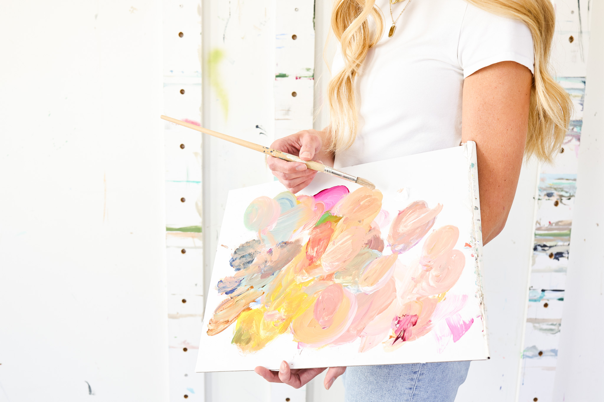
My Go-To Limited Palette:
I often start with these 5 colors and mix everything I need from them:
✅ Titanium White – For highlights and softening colors.
✅ Ultramarine Blue – A rich, warm blue great for mixing.
✅ Quinacridone Magenta – A deep, versatile red.
✅ Cadmium Yellow Medium – A warm, vibrant yellow.
✅ Raw Sienna – A warm, earthy tone for depth and neutralizing colors.
By using fewer colors, you’ll naturally create a painting that feels more intentional and balanced.
Step 2: Master the Art of Mixing (and Avoid Muddy Colors!)
If you’ve ever mixed two colors together only to end up with a dull, muddy mess, you’re not alone! The key to vibrant, rich colors is understanding how colors interact with one another.
The #1 Rule for Avoiding Mud:
Mud happens when too many colors (especially complementary colors) get mixed together. Instead of over-mixing, try layering colors on the canvas or mixing in small amounts at a time to maintain freshness.
Please note, there are times when muddy colors can be extremely useful in a painting! Especially when paired next to brighter colors to make them pop!
👉 Want to learn exactly how to mix colors like a pro? My free Color Mixing Guide walks you through my process step by step! Grab it here!
Step 3: Use Temperature and Contrast to Create Depth
One of the best ways to make your paintings feel dynamic and full of life is by understanding warm vs. cool colors and how they affect depth.
Quick Tip for Depth & Dimension:
🔥 Use warm colors for focal points. Warm colors (reds, yellows, and oranges) tend to “come forward” in a painting, drawing the viewer’s eye.
❄ Use cool colors to push areas into the background. Blues, greens, and purples tend to “recede,” creating a sense of distance and depth.
For example, if you’re painting a floral piece, you might use warmer, more saturated tones for the petals and cooler, softer hues in the background to make the flowers stand out.
Want to See These Color Techniques in Action?
These three steps will completely change how you approach color in your paintings. When you learn to simplify your palette, mix colors with confidence, and use temperature for depth, your work will feel more polished, cohesive, and professional.
Inside Studio B Art Club, I break down color theory even further and show you exactly how I create my signature color palettes for florals, abstracts, and beyond. Plus, members get access to exclusive step-by-step tutorials where I walk you through my painting process in real time.
👉 Join the waitlist here to be the first to access Art Club when doors open!
Want More Weekly Art Tips?
If you found this helpful, you’ll love our exclusive weekly art tips delivered straight to your inbox! Sign up below to get insights, painting techniques, and creative inspiration—plus first access to exciting opportunities inside Studio B.
We hate SPAM. We will never sell your information, for any reason.