Why Your Highlights Look Chalky (And What to Do Instead)
If you’ve ever tried to brighten a painting by adding white… only to end up with colors that feel flat or chalky, you’re not alone.
It’s one of the most common habits painters develop early on.
When we want to create highlights, we instinctively reach for titanium white.
But here’s a simple principle that can completely transform your paintings:
You don’t always need white to create a highlight.
Sometimes the most beautiful highlights come from increasing color saturation instead of lightening the value.
Once you start seeing this in action, it changes the way you approach color completely.
A Simple Painting Principle That Creates Beautiful Highlights
While revisiting one of my painting lessons recently, I was reminded of something powerful.
Some of the most dimensional moments in the painting didn’t come from adding more white.
They came from using a brighter, more saturated version of the same color.
For example:
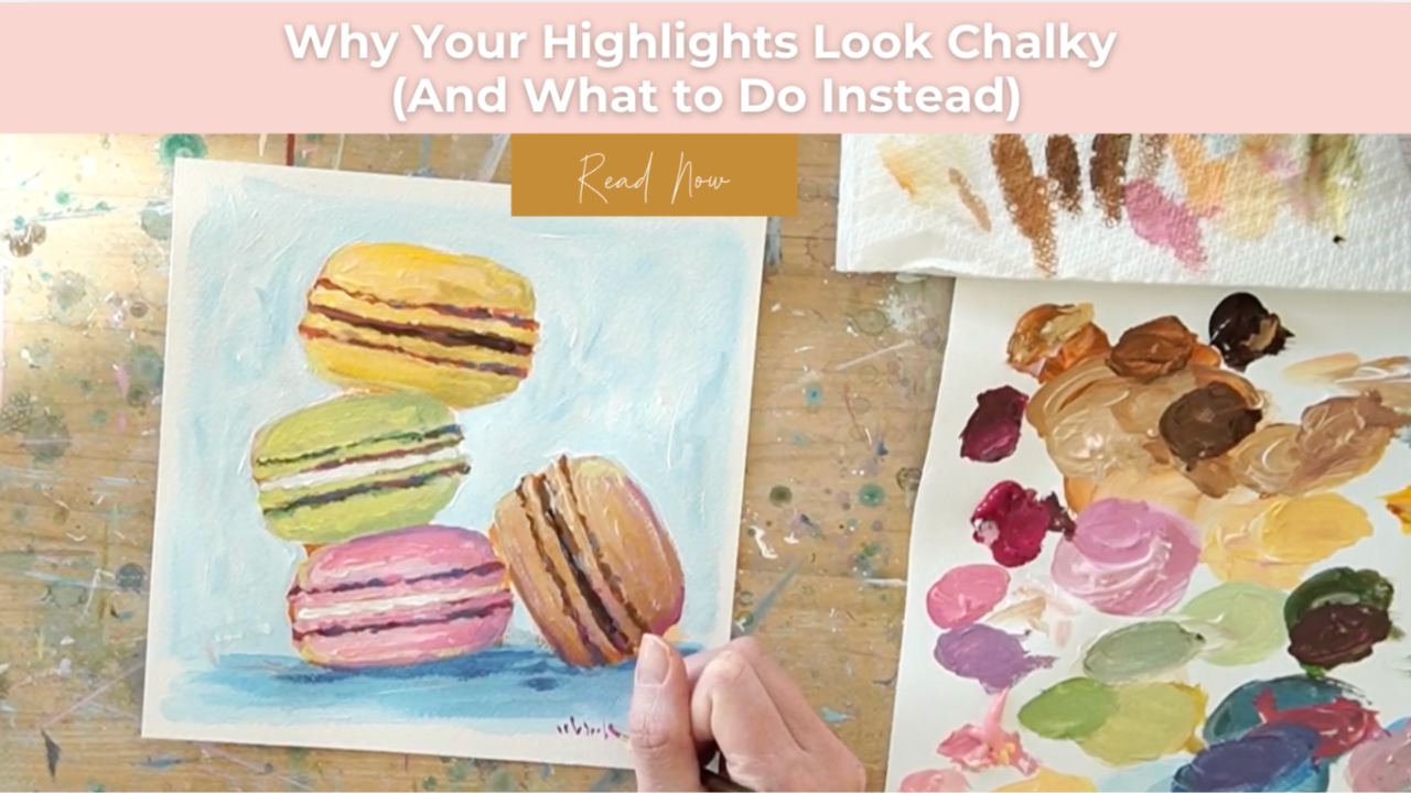
- A vibrant yellow layered over a muted yellow base suddenly reads as light.
- A brighter green against a softer green creates natural dimension.
- A more saturated pink placed over a dusty pink instantly feels like a highlight.
Even though the value shift isn’t dramatic, the painting still reads as dimensional.
Why?
Because saturation can function like value.
How Saturation Creates Natural Highlights
When a more intense color sits next to a muted version of itself, your eye reads that contrast as light.
Instead of a chalky highlight, you get something that feels:
- luminous
- vibrant
- natural
This is especially helpful when painting subjects that rely on color richness, like:
- florals
- desserts
- fruit
- landscapes
- sunsets
- botanicals
Using saturation instead of white keeps the color alive.
Why Adding Too Much White Can Flatten a Painting
Titanium white is incredibly powerful.
But when it’s added too frequently, it can cause colors to lose their vibrancy.
The result is often:
- chalky highlights
- muddy color transitions
- over-blended areas that lack energy
Instead of glowing, the painting can start to feel dull.
That’s why many experienced painters reach for color intensity first, and white only when it’s truly necessary.
How to Use Saturation to Create Highlights
Next time you’re working on a painting, try this simple approach.
Instead of immediately adding white, experiment with increasing the saturation of the same hue.
Here’s a simple way to do it:
- Start with a muted base color
Lay down your first layer using a slightly softened or neutralized color. - Mix a cleaner, brighter version of the same hue
Remove some of the neutralization and allow the color to become more vibrant. - Layer it where light would naturally hit
Place this brighter color strategically on top of the muted base. - Let the base layer show through
The muted color underneath creates natural contrast.
This simple layering technique allows the brighter color to read as light, even without a major value shift.
Why This Technique Works So Well
When saturation is used intentionally, your paintings maintain a sense of luminosity.
Instead of flattening the color, you’re building layers that feel:
- richer
- more dimensional
- more expressive
The painting retains energy because the color relationships stay intact.
Often this creates a far more sophisticated look than simply lightening everything with white.
Try This Experiment in Your Next Painting
If your paintings ever feel dull or over-blended, try this quick test:
Before reaching for titanium white, ask yourself:
Can I create this highlight with a brighter version of the same color instead?
Mix a cleaner hue.
Layer it where light would naturally hit.
Let the muted layer underneath do the work.
You may find that your painting suddenly feels more vibrant and alive.
And you might discover you don’t need nearly as much white as you thought.
Final Thoughts
Small shifts in how you use color can completely elevate your paintings.
Learning to see saturation as a tool for creating highlights is one of those shifts.
It keeps your colors luminous, prevents chalky passages, and helps your paintings feel richer and more dimensional.
Next time you're painting florals, desserts, or landscapes, experiment with saturation first.
You might be surprised how powerful that one adjustment can be.
Want More Weekly Art Tips?
If you found this helpful, you’ll love our exclusive weekly art tips delivered straight to your inbox! Sign up below to get insights, painting techniques, and creative inspiration—plus first access to exciting opportunities inside Studio B.
We hate SPAM. We will never sell your information, for any reason.