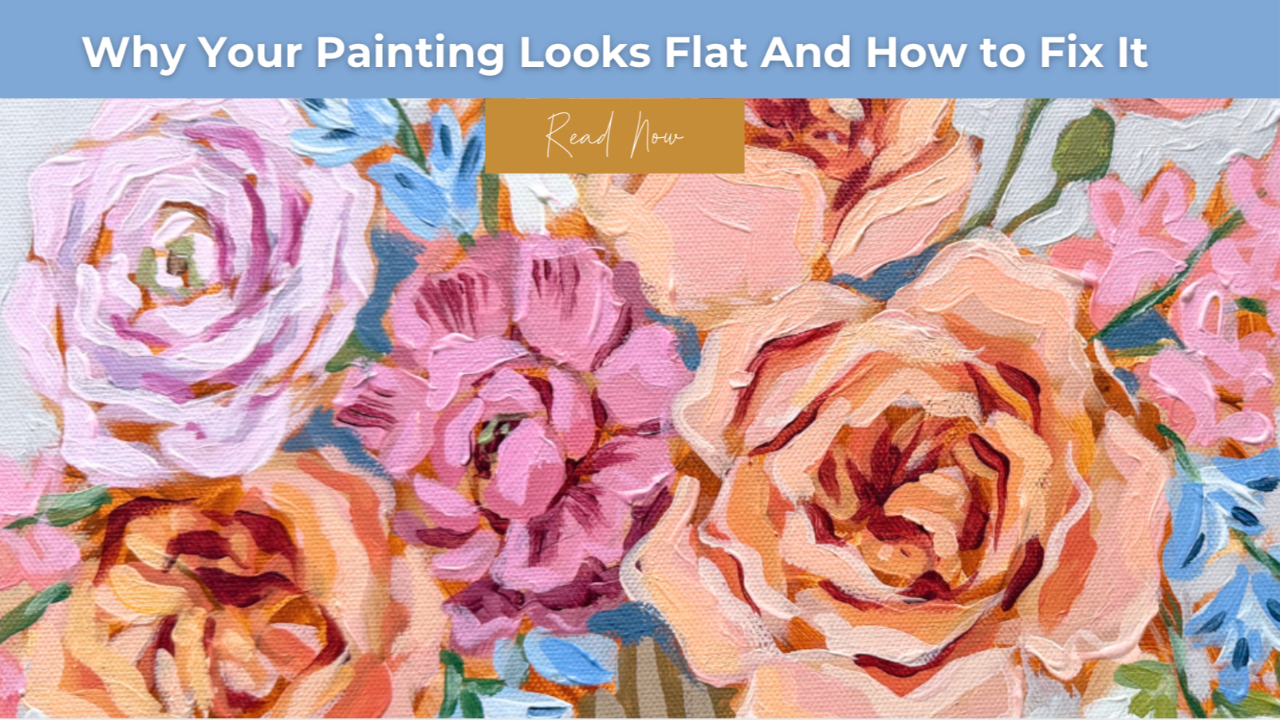
Why Your Painting Looks Flat (And How to Fix It)
If your painting has strong lines, solid shapes, and beautiful color but still feels like it’s missing something…
The issue may not be your drawing.
It may be your contrast placement.
This is one of the most common problems I see with developing painters. Everything technically looks “correct,” but the painting still lacks depth, richness, and visual impact.
The reason is often surprisingly simple:
Your darkest shadows aren’t working in the right places.
Learning to control contrast is one of the biggest breakthroughs you can have as a painter.
And once you understand how it works, it can completely transform the way your paintings feel.
The Secret to Stronger, More Dimensional Paintings
Many artists assume stronger contrast means adding more dark paint or making shadows more dramatic.
But that’s not actually what creates depth.
The real key is where your darkest values live.
When darks are scattered evenly across a subject, every area competes for attention.
But when the deepest shadows are concentrated in specific places, something powerful happens.
Your painting starts to feel:
- more dimensional
- more structured
- more visually intentional
Instead of everything feeling outlined or flat.
Where Your Darkest Shadows Should Go
In most subjects — especially florals — the strongest shadows naturally occur where forms overlap or fold inward.
Think about:
- where petals tuck behind one another
• where shapes curve inward
• where the center of the flower is the most dense
These areas create what artists often call the core shadows.
When your darkest values are concentrated in these areas, the rest of the painting begins to make sense visually.
Your highlights glow.
Your forms round out.
Your painting feels alive instead of outlined.
Why Contrast Creates Depth in a Painting
Contrast is what gives structure to a painting.
Without strong value relationships, even beautiful color can feel flat.
Think of it this way:
- Shadows create depth.
- Contrast creates structure.
- Light only shines because darkness gives it somewhere to sit.
When painters understand this relationship, they stop trying to “outline” shapes and start building form with value instead.
This is when paintings begin to look more professional and dimensional.
A Simple Contrast Exercise to Try in Your Next Painting
If you want to strengthen the depth in your work, try this simple shift.
Instead of placing shadows everywhere, focus on grouping your darkest values together.
Start by asking:
Where is the deepest part of this form?
Where do shapes overlap or fold inward?
Place your darkest values there first.
Then allow the outer areas of the subject to stay lighter and softer.
This creates a natural visual hierarchy that makes the painting feel more balanced and dimensional.
Why This Matters for Floral Paintings
Florals are one of the best subjects for studying contrast placement.
Flowers naturally have:
- layered petals
- curved forms
- overlapping shapes
Which means they provide endless opportunities to practice placing shadows intentionally.
When your darkest values stay tucked into the center and inner folds, the outer petals can breathe.
The result is a painting that feels:
- soft
- romantic
- dimensional
- full of life
Instead of busy or overworked.
Learning to See Contrast Like an Artist
Developing an eye for contrast is one of the most important skills you can build as a painter.
It allows you to move beyond simply following steps and begin understanding why a painting works.
Once you start seeing how light and shadow interact within a subject, you’ll notice that your paintings naturally begin to feel more confident and expressive.
And often, it only takes a few small adjustments in your value placement to completely transform a painting.
Final Thoughts
If your painting feels flat even though your drawing looks solid, take a step back and evaluate your contrast.
Ask yourself:
Are my darkest values scattered everywhere?
Or are they concentrated where the form naturally folds and deepens?
That one shift can bring an incredible amount of depth and richness to your work.
Want More Weekly Art Tips?
If you found this helpful, you’ll love our exclusive weekly art tips delivered straight to your inbox! Sign up below to get insights, painting techniques, and creative inspiration—plus first access to exciting opportunities inside Studio B.
We hate SPAM. We will never sell your information, for any reason.